Creating dashboards in OpenSearch
Scroll DownWhat is OpenSearch Dashboard?
OpenSearch Dashboard is a web-based user interface that allows you to manage and visualize data stored in an OpenSearch cluster.
With the OpenSearch Dashboard, you can create and save custom dashboards, set up alerts to be notified of changes in your data, and explore your data using various search and filter capabilities.
How to create a dashboard in OpenSearch Dashboard?
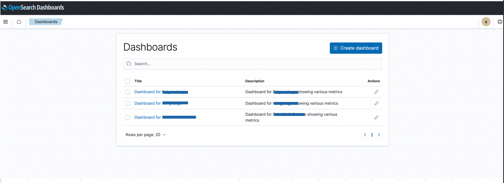
- Once you’re in the home page of the OVD dashboard, click on the hamburger button on the left side of the screen and click on Dashboard option.

2. You can view the list of all the dashboards, in order to create a new dashboard, click on the Create dashboard button.
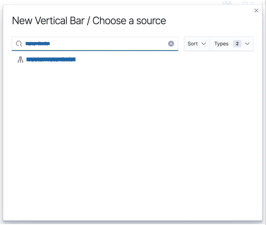
3. Click on the Create new button to create a new visualization. Choose a visualization type of your choice like Area, Pie, Vertical bar, Horizontal bar, etc.
More information can be found here - https://opensearch.org/docs/latest/dashboards/visualize/viz-index/
Note: Multiple visualizations can be clubbed together to make a single dashboard.
4. Once the visualization type is selected, now you have to choose a source against which you want to create a visualization. Type the index name that you wish to see on the dashboard.
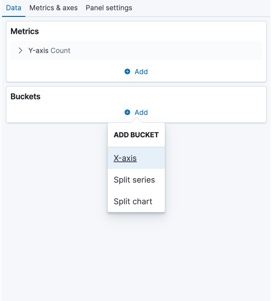
5. Once you choose a source, now you have to choose metrics and buckets that you want to see on the chart.
- Metrics aggregations are a set of functions that allow you to perform calculations on numeric values in your data, such as counts, sums, averages, minimum and maximum values, and more.
- Some of the most commonly used metric aggregations in OpenSearch are count, sum, average, min, max, etc.
https://opensearch.org/docs/latest/aggregations/metric-agg/
- Bucket aggregations are a set of functions that allow you to group your data into buckets based on one or more criteria, such as terms, ranges, or date intervals. These bucket aggregations can be used to organize your data into meaningful categories, which can then be used to perform further analysis using other aggregations or filters.
- Some of the most commonly used bucket aggregations in OpenSearch are terms, date histogram, range, filters, etc.
https://opensearch.org/docs/latest/aggregations/bucket-agg/
6. Let’s go with Count as the metric aggregator, you can choose the bucket aggregator as per your preference on how you would like to see the data on the chart, available options in this type of visualization are X-axis, Split series and Split chart. For this example, we’ll go with the X-axis.
Note: The type of bucket types differs for visualization types.
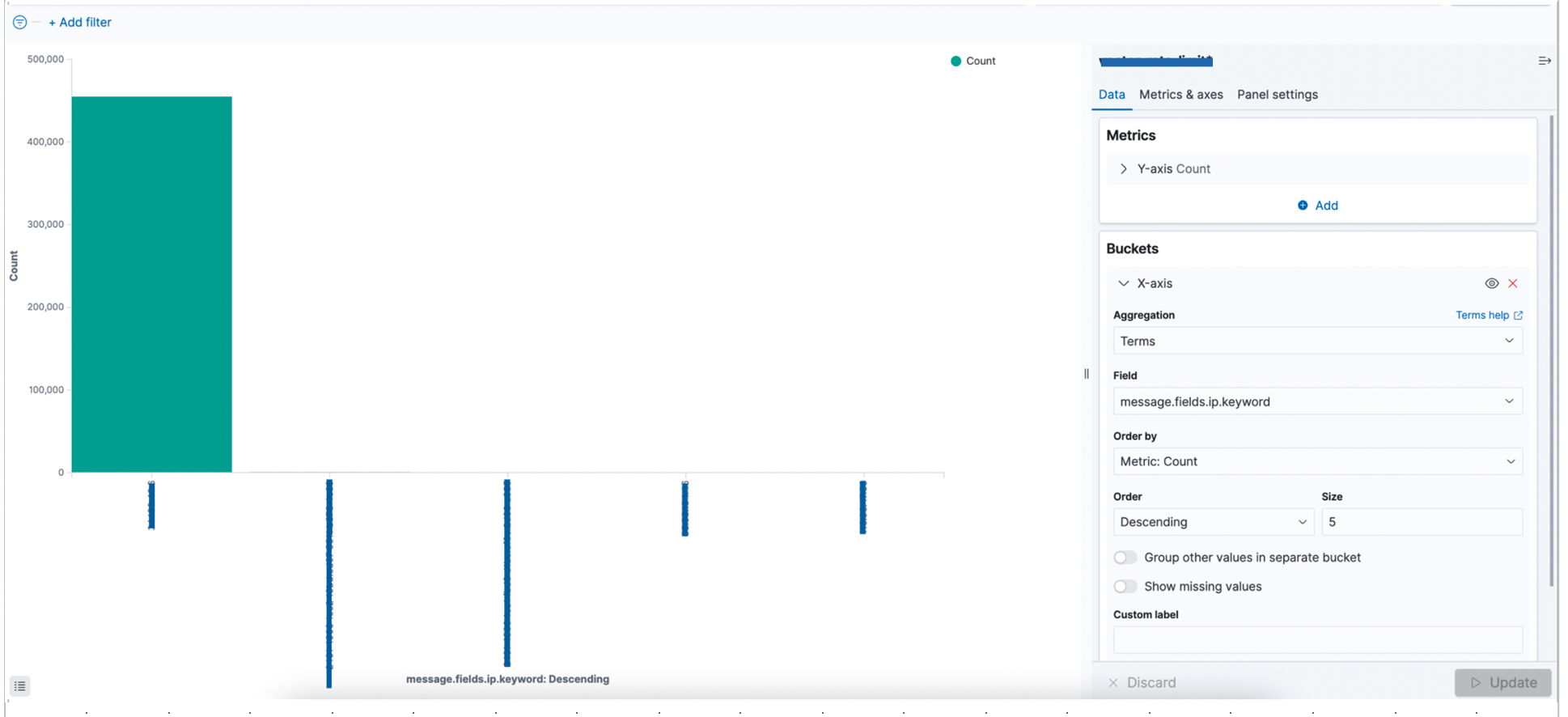
7. After choosing X-axis as the bucket, we can now choose the aggregator type from the above mentioned list in point 6. We will use Terms as the aggregator.
Under the field type, choose the field against which you want to see the data on the chart like an IP address, user-agent, country, etc.
We can also limit the size on the chart to our choice, sort by ascending or descending order.
Under the Advanced section, you can include/exclude specific attributes of your choice.
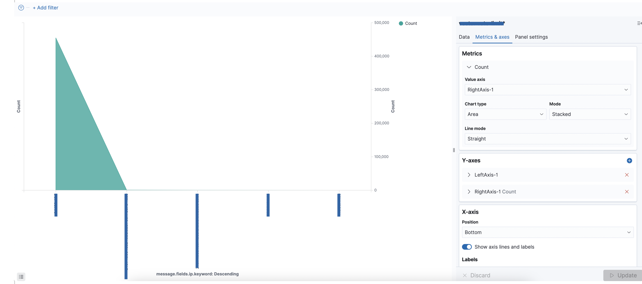
8. Once the data part is added, now we can do more customizations to our chart by playing around with various options like changing the value axis, chart type, mode, etc.
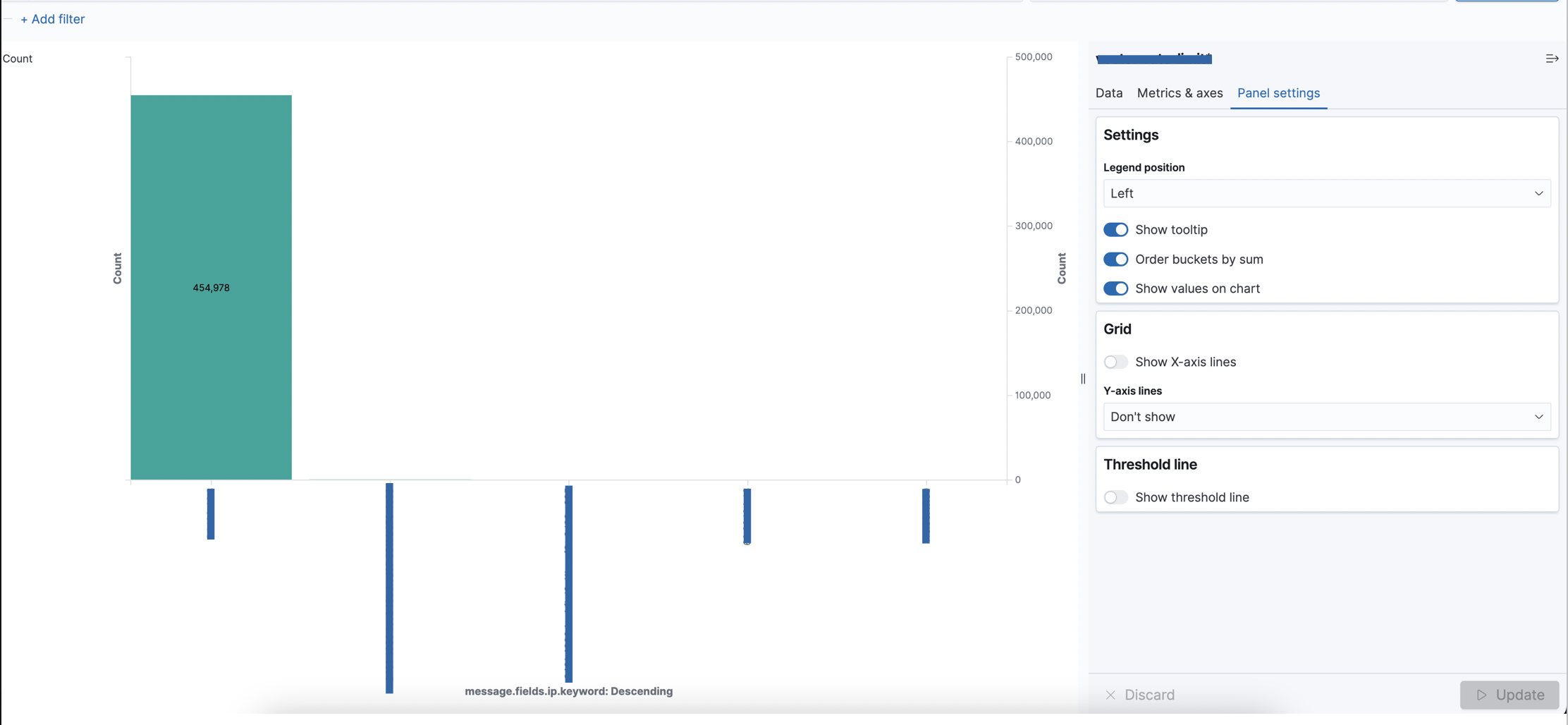
9. More information can be added to the chart by modifying Panel Settings like changing the legend position, showing values on chart, etc.
10. After adding all the possible attributes, we can finally save the visualization by clicking on Save on the top right corner and by giving an appropriate name and a description to your visualization.
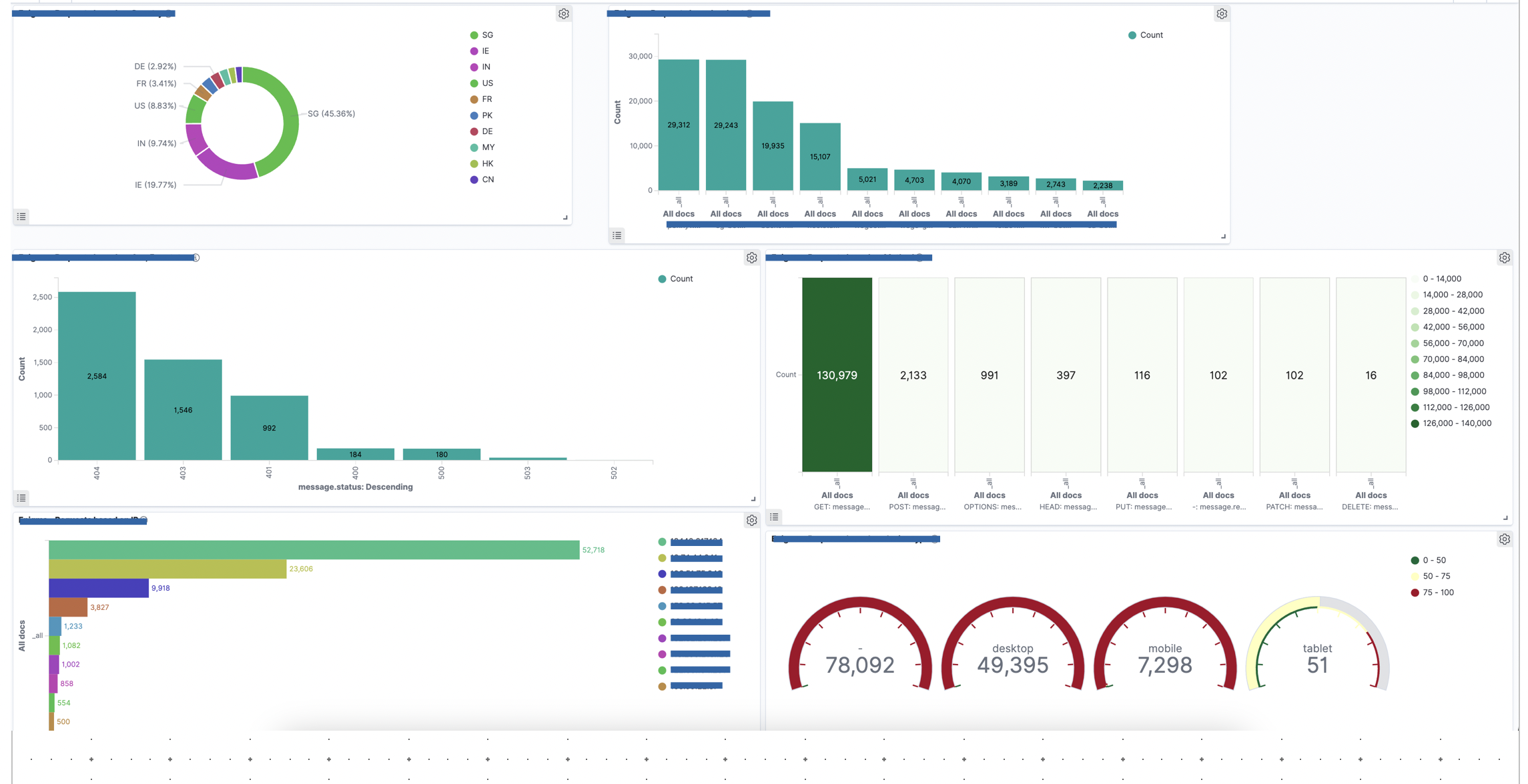
11. Finally, the new visualization would be seen under the dashboard and you can check all the visualizations under one hood for a single index like below example.
Overall, the OpenSearch Dashboard provides a powerful tool for managing and analysing your data stored in an OpenSearch cluster, making it easier for you to extract insights and make informed decisions.
View Comments